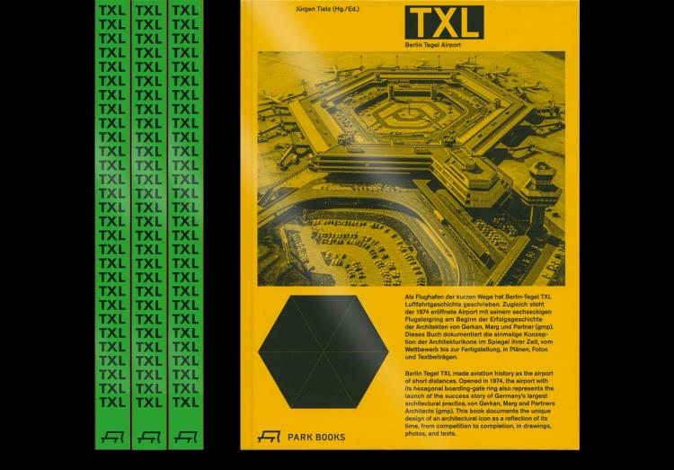
Entwicklung eines Buch- und Gestaltungskonzepts zur Dokumentation der Entstehung des Flughafen Tegels in Zusammenarbeit mit den Architekten von Gerkan und Marg und einem Redaktionsteam. Eine Ortsbegehung, die Sichtung des Archivmaterials und weitere Recherchearbeit und inhaltliche Auseinandersetzung waren die Basis für unsere Beratung bei der Bildredaktion und für die Erarbeitung der Bilddramaturgie. Die Auftragsvergabe für die Umsetzung erfolgte nach Abnahme des Gestaltungskonzepts. Der Fotoband erschien wie geplant zur Schließung des Flughafen Tegels im November 2020. Die erste Auflage ist vergriffen.
Grid
The design of the inside pages is built on two elements: typeface and grid. Both are constants, but neither is governed by strict rules. This openness allows for a flexible response to the material and content, enabling each page to be designed individually. The second constant: We use Berthold Akzidenz Grotesk, the typeface originally employed for the wayfinding system at Tegel Airport. It is used in a single size, regardless of the type of text. Essays, author names, page numbers, titles, and captions are not differentiated by scale. We use 11 point — unusually large for body text, unusually small for a headline. Attention is provoked through restraint and monotony. The second constant is a hexagonal grid. The unconventional proportions and spacing it produces hold the pages together visually, without the underlying structure being immediately apparent to the viewer. The pages feel openly composed.