Nr
00216
Project
Stahlstadtschule
Publisher
Jovis
Year
2024
Client
c/o now
00216 fig. 001

‘da’ stands for the ‘die architektur’ – architecture department at the University of Art and Design Linz. c/o now, architectural collective and Sigi Atteneder are part of this department at the University of Linz. Together, they have published this collection of texts and documents to create a portrait of the history of architecture in Linz. The occasion was the anniversary of the Department of Architecture.

We developed the concept in collaboration with c/o now. Several strands of information run in parallel and chronologically throughout this book. The first strand deals with the history of architecture in Linz; the second strand lists socio-political events, in the form of documents, newspaper cuttings and the like, thereby providing the context. Thirdly, the works produced at the University of Linz during the same period are placed in chronological order. Fourthly, lecturers currently teaching at the University of Linz contribute their perspectives.


We have chosen the largest possible format for this book so that we can present as much information as possible side by side and emphasise the sense of simultaneity.

Text and image should be given equal prominence. There is only one font size and a very narrow, newspaper-style text column that runs through the book, weaving its way between the images. Captions become text, text becomes captions, and so on. The images come edge to edge; the lines break hurriedly as you read, and at a brisk pace you can work your way through the socio-political architectural developments in Linz from 1973 right up to the present day.

This collage concept and the tight grid allow the lower-resolution images to be reproduced small and the better ones large: the content helps to determine the layout, and technical problems resolve themselves as if by magic.

00216 fig. 016
00216 fig. 017
00216 fig. 018
00216 fig. 019
00216 fig. 020
00216 fig. 021

Cover simulation
publisher preview

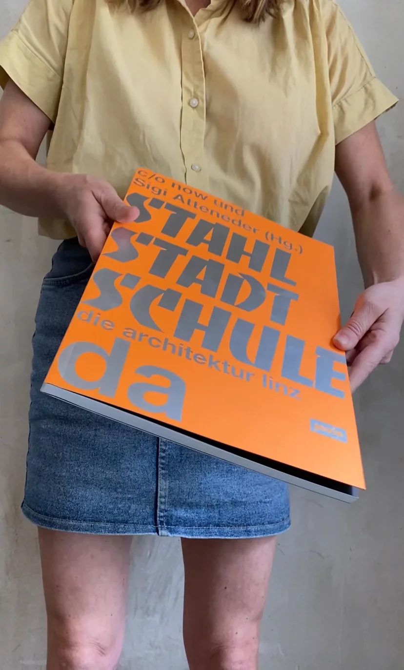
The book’s title refers to the city’s given name during the Nazi era, ‘Stahlstadt’, and to the name of the Linz-based band ‘Stahlstadtkinder’. For the cover, we decided to declare the ‘Banco’ typeface the best substitute for gothic type and to use neon orange with reflective paint, so as to position ourselves where we’d all like to be situated: somewhere between a corner store and the city’s street cleaning service.

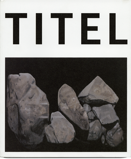
All image edges in this book meet the edge of the paper without any bleed. This means that 3 millimetres of the image is not necessarily missing; rather, only the part that the machine cuts off is missing – or not, if it does not cut anything off. (See also: Titel)

Editorial team:
c/o now
Editorial team:
Sigi Atteneder
Production management:
Theresa Hartherz, Jovis Verlag
Produvtion:
Susanne Rösler, Jovis Verlag
Editorial assistant:
Silvester Kreil