Here, we are especially proud to be responsible for the key visual, the sausage. We were commissioned to design the exhibition campaign without showing any of the works in the exhibition. They were to remain a secret right up until the end. We had to find a ‘third thing’ that encapsulates the exhibition and puts the finger on the right spot: not to tickle the funny bone; this is a serious matter; yet it still needs to whet the appetite, otherwise no one will come; more of an invitation to take a stroll on the edge of the abyss into (German) madness.
Leporello (en)
front and back
Leporello (de)
front
Leporello (de)
back
Tests and planning prior to development: a page from the presentation PDF on the topic of the Leporello. This was preceded by discussions about labels for the exhibited works. The idea of including the “orientation sausage”—complete with all the information—which every visitor can take home as a souvenir, convinced out customers. Of course, technical aspects, costs, and the visual impact in the exhibition setting were also weighed. For maximum “sausage effect”—which still seemed manageable—we recommended the Leporello shown here: 18 pages, 210 x 950 cm, zigzag fold, 3-up layout.
One page
from the presentation PDF
'Leporello'
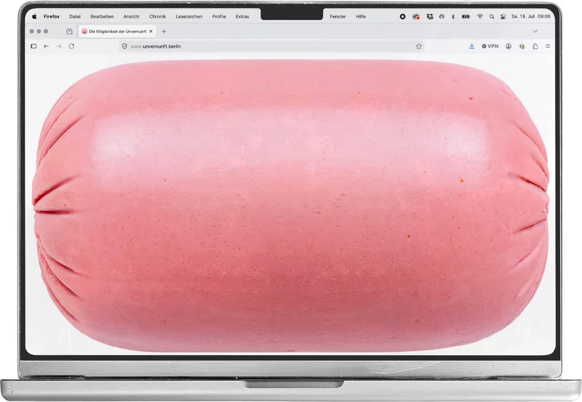
The idea to use this Lioner sausage as the key visual was the result of extensive sausage research. The concept of using sausage to summarize the exhibition without giving it away came to us quickly. It’s German (relevant because of the exhibition's content), looks good, is both gross and appealing, is visually easy to grasp, and raises the right questions (Question: ‘What is this about?’; Answer: ‘It is about sausage.’ Which translates to: ‘Es geht um die Wurst’ (engl.: It’s about life and death). Further there is the expression: ‘Es ist mir wurst.’ (engl.: I couldn’t care less) and a song called ‘Alles hat ein Ende, nur die Wurst hat zwei’ (engl.: Everything has an end, only the sausage has two; ). ‘Wurst’ is an indispensable part of the german language … and looks like art.
Social media clips
drafts
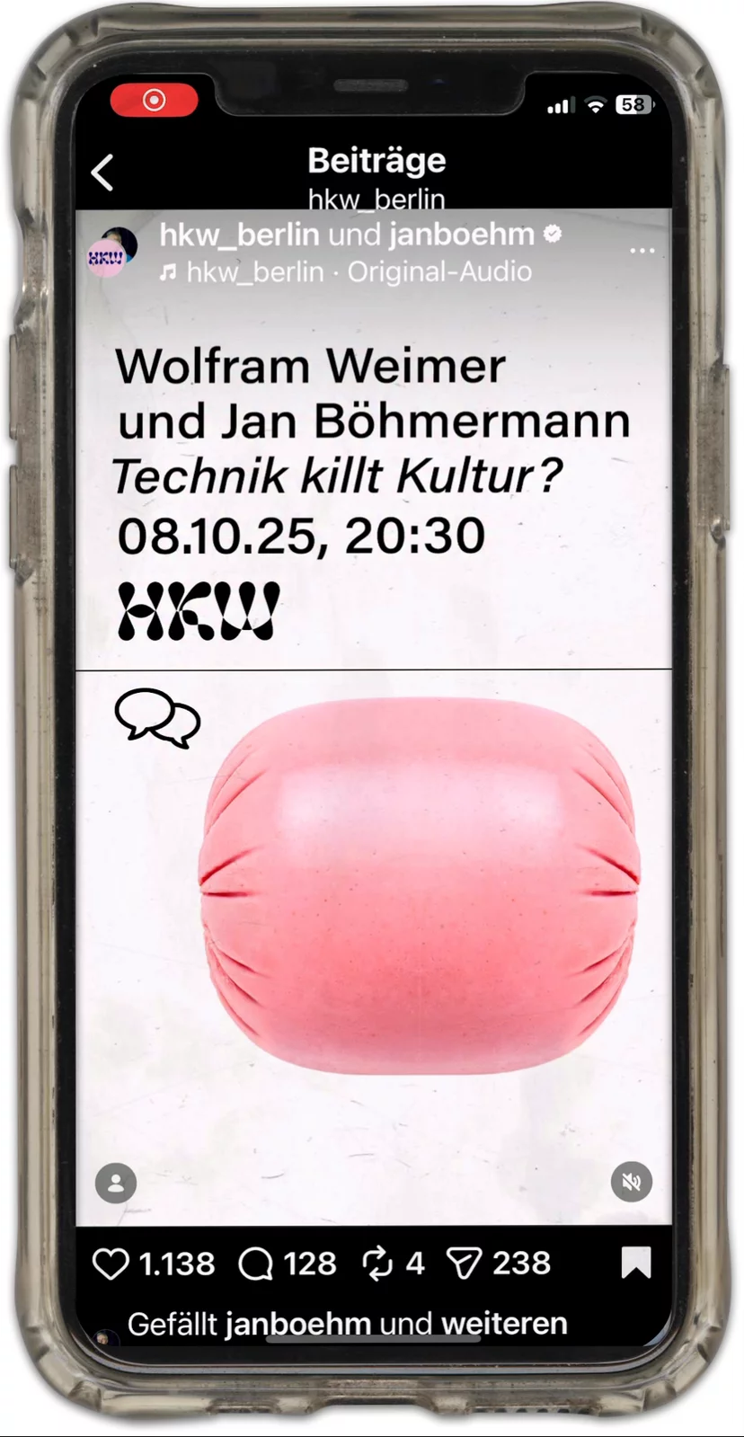
Clip
Instagram
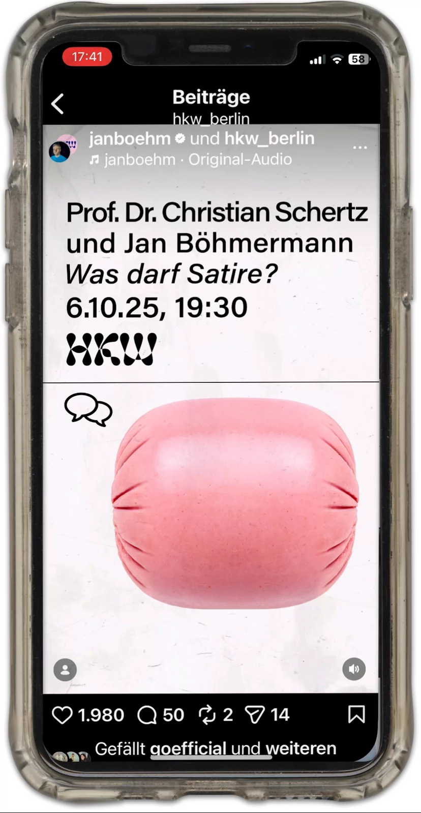
Clip
Instagram
Template
discourse program
Template
music program
Template
non-stop program
Visitors sticker multifunktional
Exhibition poster
‘The Federal Government Commissioner for Culture and the Media’ – at that time, Weimer – has a German eagle in his logo and the colours of the flag. The Federal Government makes our key visual – the sausage – look even more German, even more questionable, whilst at the same time suggesting high-quality German meat. The sausage becomes even more sausagy, everything more nationalistic and, at the same time, quality-assured. Weimer becomes a meat apointee. Staff from all departments were stressed out, preemptive obedience ruled – we should move the logo away from the sausage again, make it smaller and move it down; major dramas and manoeuvres ensued: in the end, the ‘bosses’ had a phone call and decided things could stay as they were. So it wasn’t all that radical after all.
Exhibition poster, from a distance
Project logo
Unterhaltungsfernsehen Ehrenfeld
unsolicited
This isn’t the first project in which we’ve ‘used’ one of the logos we’ve been given, see also Moshe Gershuni, Neue Nationalgalerie. But it is the first project we re-designed a logo given to us, because it didn’t work for our poster design. The logo we re-designed was our clients logo, Jan Böhmermann’s production firm ‘Unterhaltungsfernsehen Ehrenfeld’. No commission, we just presented it: we liked that it is plum and round, about to burst and that it helps making it easier to see that the HKW logo actually depicts a chain of sausages.
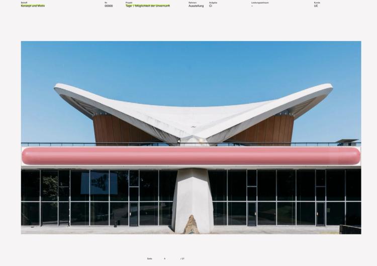
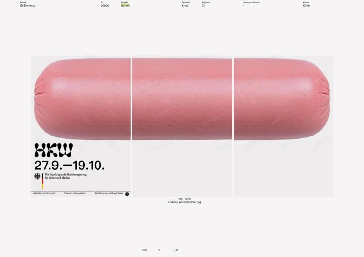
Excerpt from one of our presentations: “(…) In Title 2 (The Possibility of Irrationality), the sausages become absurd symbols of the infinite world of possibilities (beer sausage, liver sausage, Vienna sausage, sausage face, …); Admirable human achievement or simply embarrassingly stupid, groundedness, tradition versus new awareness, death, the abstraction of meat, meat in the gut in phallic form; and German obtuseness – all of this is then conceivable. This is where the murderer hides his bodies. (…)“
Credits
- Image Editing:
- Max Color